

Hues by Harriet
PROJECT SCOPE:
Brand Design
OVERVIEW:
Harriet needed a brand identity that could better reflect the emotional nuance and nostalgic quality of her photography as her business began attracting more considered, higher-value enquiries.
Her previous DIY branding no longer communicated the level of intention behind her work, which made it harder to convert clients seeking a more premium, story-led photography experience. The goal was to strengthen perceived value and ensure her visual presence aligned with the calibre of her portfolio.
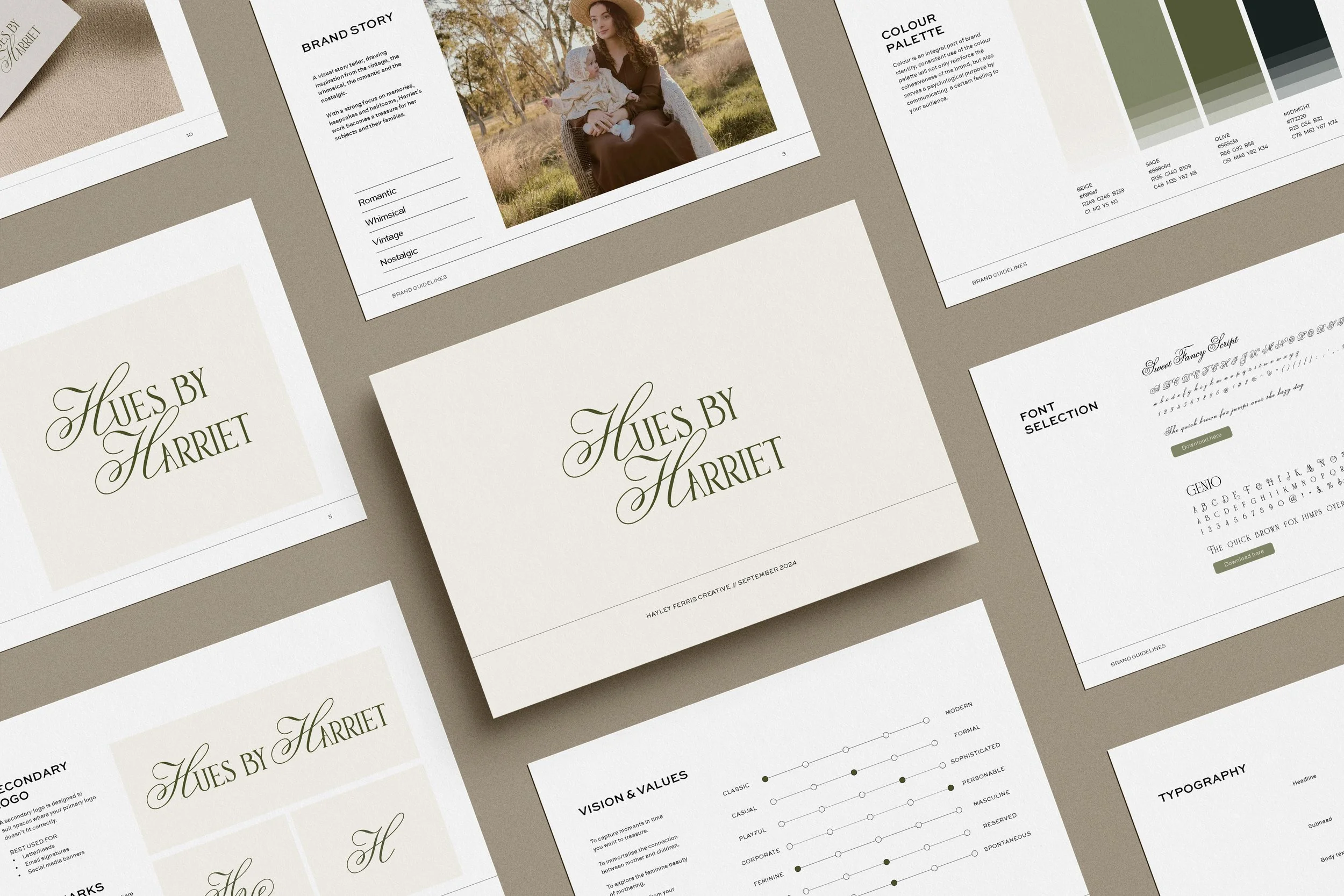
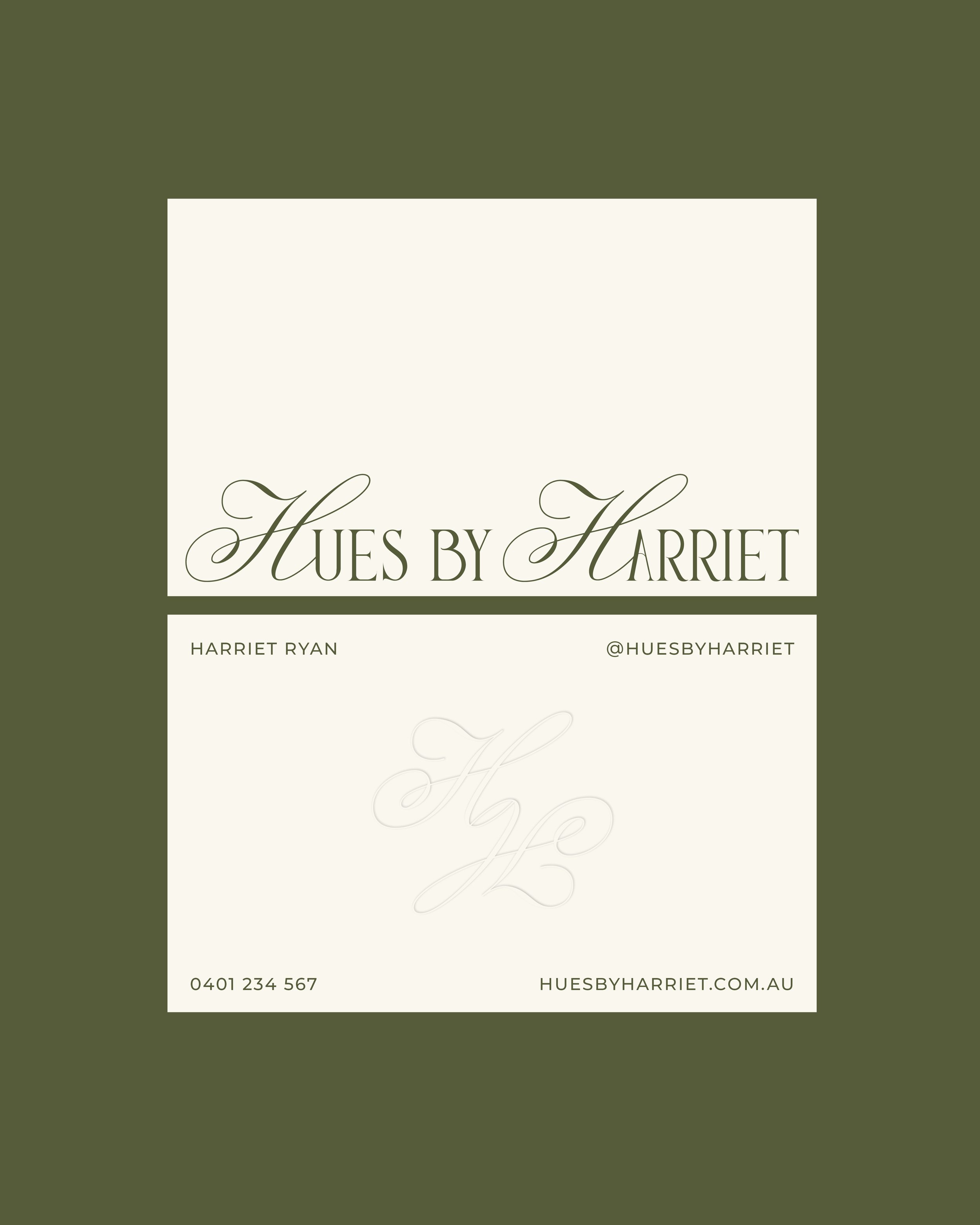
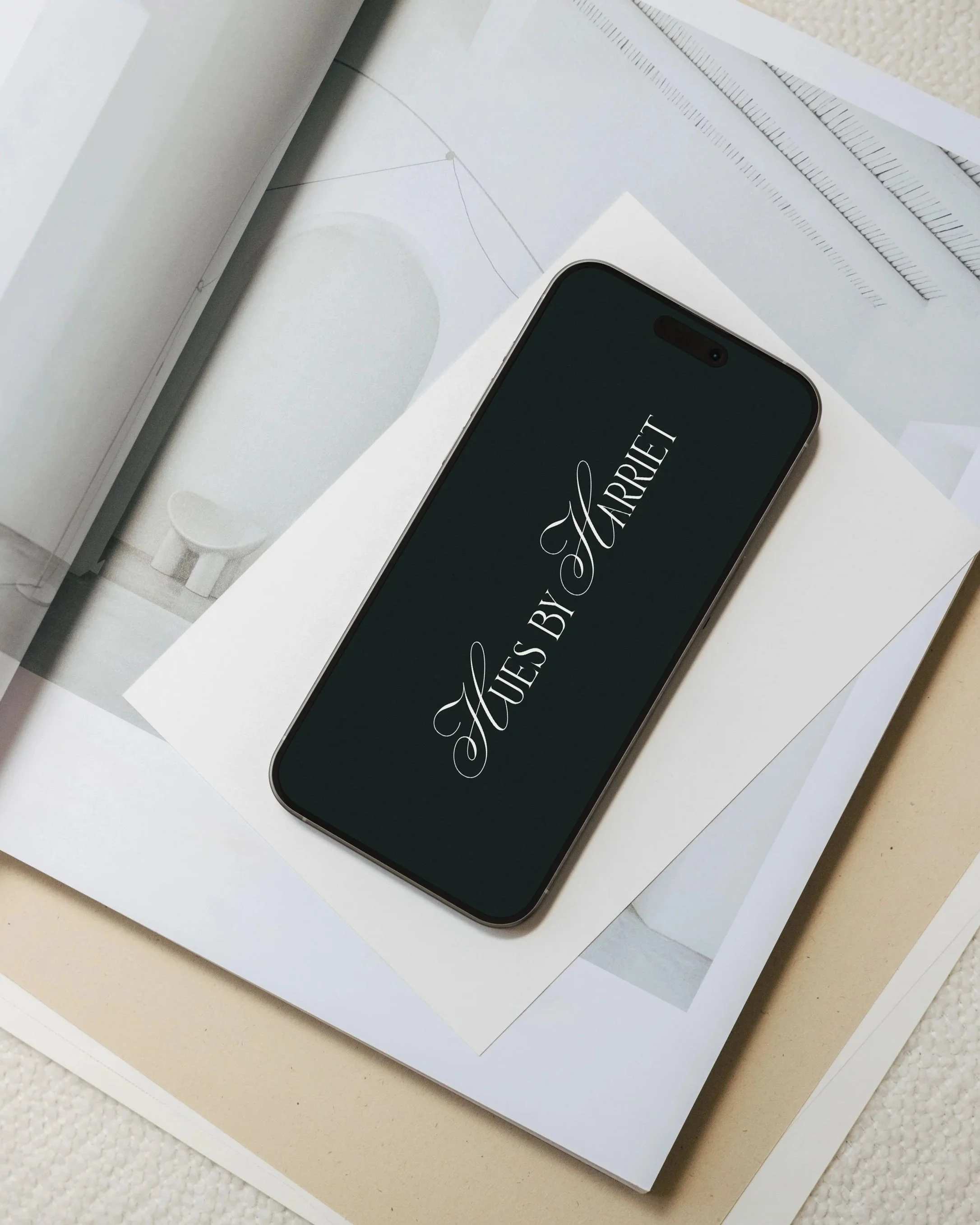
The refreshed identity was designed to improve how potential clients interpret her work at first touchpoint, creating stronger alignment between inquiry and booking. A vintage-inspired foundation informed a refined wordmark built from a customised typeface, chosen to express warmth, elegance and emotional depth.
The result is a more recognisable brand that increases enquiry-to-booking confidence, attracts more aligned clients who value artistic storytelling, and supports higher pricing through a clearer sense of craft and professionalism.


“I have worked with Hayley previously, so when it came time to get some branding done for my new business I knew she would be able to deliver - and she definitely did! I am so thrilled with the final result, quick turn around and easy process. Thank you Hayley for your beautiful work and expertise.”
Harriet, Hues by Harriet