Capital Aligned Constructions
PROJECT SCOPE:
Brand Design
Brand Collateral
OVERVIEW:
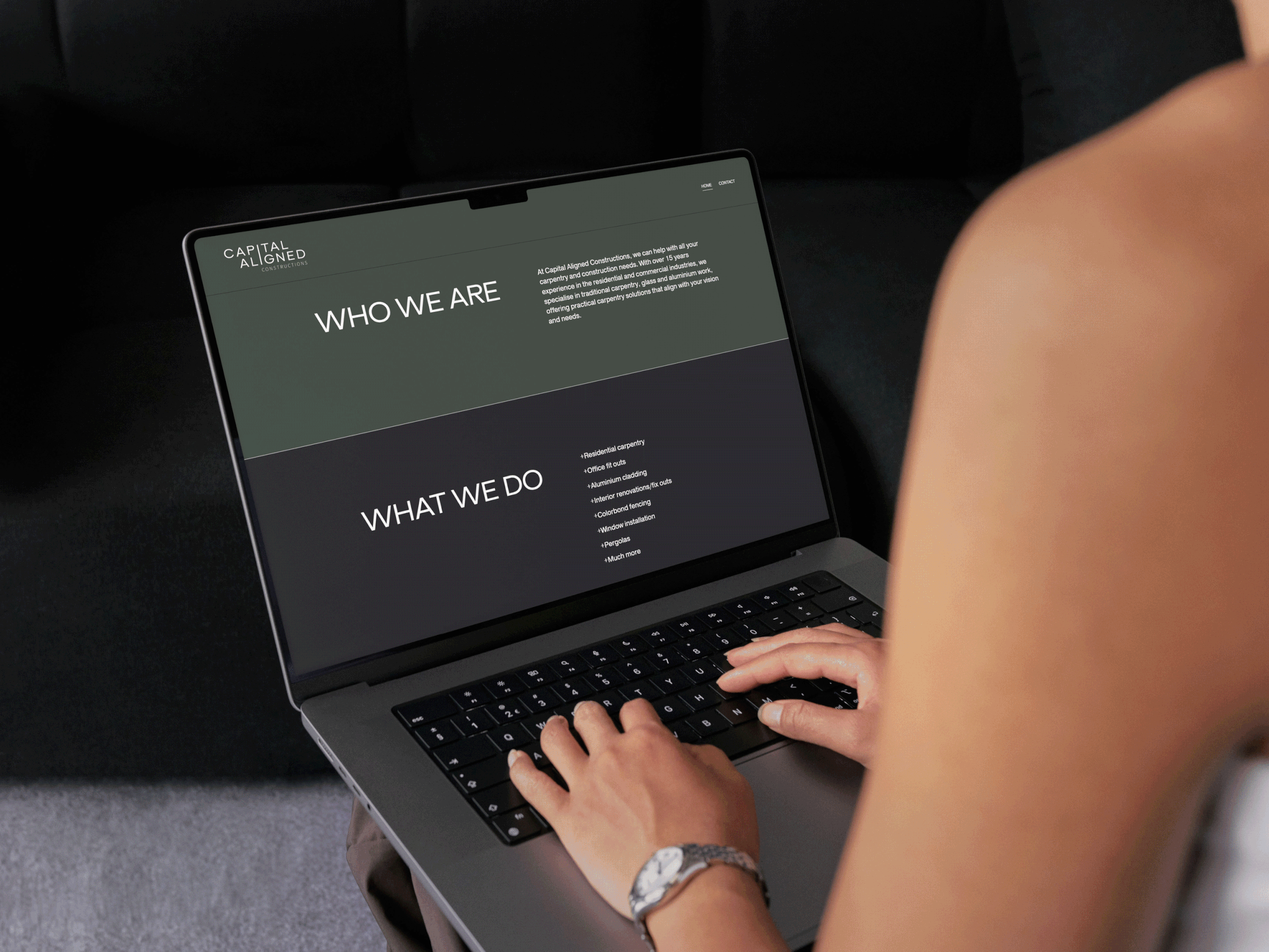
Capital Aligned Constructions needed a brand identity built from the ground up that could immediately establish credibility in a competitive construction market. Working across fit-outs, storefronts and custom ceilings for both commercial and government clients, the business needed to communicate precision, reliability and craftsmanship from day one, ensuring strong first impressions with larger, more procurement-driven clients across Canberra.
The identity was designed to support early-stage growth by creating instant clarity and differentiation in a crowded local market. Alignment becomes a core idea throughout the identity, expressed through structured layouts, a refined logotype and a restrained, confident colour palette to reinforce the detail-driven nature of their work.
The result is a brand that accelerates trust at the point of enquiry, strengthens perceived capability, and positions Capital Aligned Constructions as a premium, dependable partner capable of securing and delivering high-value projects.